Walgreens Photo: UX/Microcopy
Client: Walgreens Photo
Brief: Develop new UX copy for Photo Calendar Builder (within Snapfish platform); I was a contract Senior Copywriter at Walgreens at this time.
Response: New copy was needed for the Walgreens photo builder (on the Snapfish platform), to convey our new capacity to add “custom events” (rather than just the two options of “birthday’ or “wedding”) to Photo Calendars. My goal was to keep the copy simple, instructional, and on-brand — and to explain the process for adding the events, and how much space for customer images/captions could be accommodated. I worked with the UX designer and a product manager to determine aspects including how much space my copy could take, and on which portion of the screen/page it would appear or pop up. We iterated together, did an in-house QA process, made minor refinements for clarity and simplicity, and then the update went live within a few days of the project start.
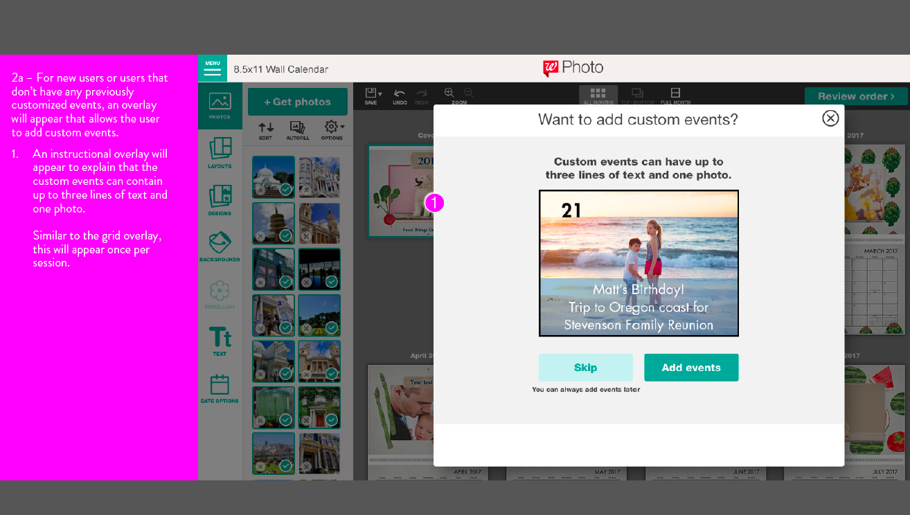
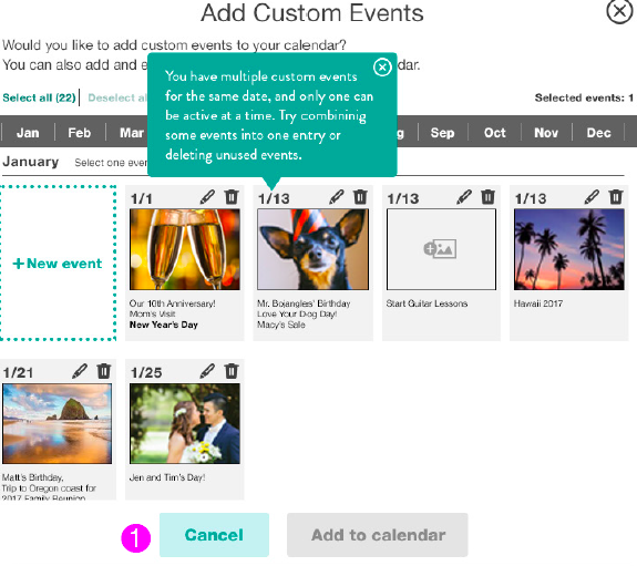
1). This first image shows the customer the new option to add “custom” events; in the past, the only event options have been birthday or weddings, and so some expository text was needed to explain the new option and that they could only work in one of the “events” at a time.
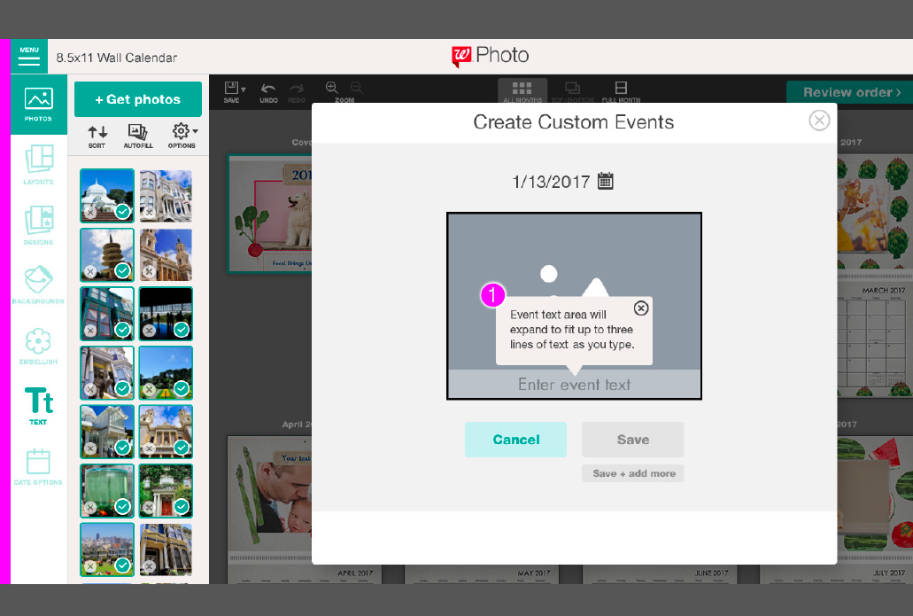
2). The below image depicts the detailed yet short microcopy I wrote to explain the spatial constraints of the “event text” field.
3). The below image displays an “example” image and text, generated for the user to convey to them how their photo will look with the constraint mentioned in the prior screen, (“three lines of text and one photo.”) These visual examples that show examples of photo layouts are based on empathy for our users; we want to help them navigate the builder and changes as seamlessly as possible.