Walgreens Photo: UX Error Page Copy
Client: Walgreens Photo
Brief: Develop new UX “error” copy for the Walgreens Pharmacy vertical. I was a contract Senior Copywriter at Walgreens at this time.
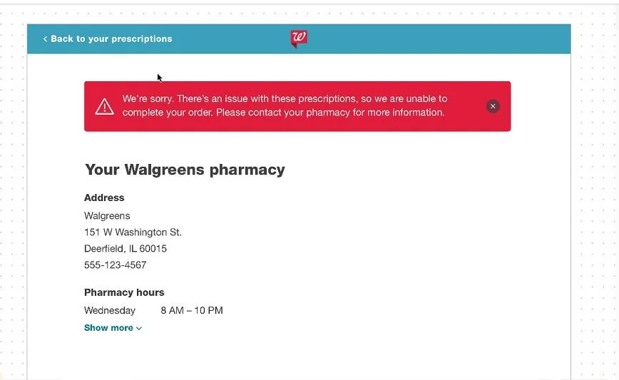
Response: New microcopy was needed for a Walgreens pharmacy error page. The scenario I was writing to was that the customer’s prescription could not be filled. The possible reasons for this error were myriad (i.e., this could have been due to a number of factors—a credit card issue, doctor’s approval needed, etc).
The writing challenge assigned to me by the product manager was to phrase the short copy in a general enough way to cover all of the possible circumstances in a short, polite manner, and to direct the customer to phone their pharmacist. In addition, the creative director wanted to ensure that all micro and error copy stayed in line with our new brand standards around tone and voice.
Since this copy represented a disappointing roadblock in the customer’s experience, my goal was to keep the copy simple, instructional, helpful and on-brand and I landed on a short apology, general “there’s an error” language, with a note to contact their local pharmacy. I collaborated with the UI designer to understand how much space was available for content, and this new copy, which led to 44% fewer redirects, was launched within a few days of stakeholder approval.